↑ As the designer for Ecorede´s brand evolution, my challenge was to maintain its core identity while infusing vitality and movement. By collaborating closely with the team, we identified a brand persona that balances maturity with youthfulness, values unity and belonging, and embodies a dynamic, multifaceted spirit—leading to the new tagline: “em movimento” (in motion).
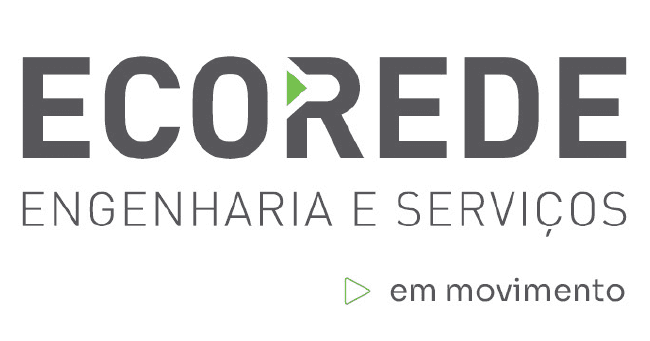
↓ The Ecorede logo’s triangular element, a key part of its identity, was retained for recognition but reimagined to reflect evolution. Rounded edges bring softness and approachability, aligning with the brand’s welcoming nature. The elongated, sharpened shape suggests forward motion and evokes a play symbol, embodying progress and new beginnings while balancing familiarity with innovation.
← As the designer for Ecorede´s brand evolution, my challenge was to maintain its core identity while infusing vitality and movement. By collaborating closely with the team, we identified a brand persona that balances maturity with youthfulness, values unity and belonging, and embodies a dynamic, multifaceted spirit—leading to the new tagline: “em movimento” (in motion).
The Ecorede logo’s triangular element, a key part of its identity, was retained for recognition but reimagined to reflect evolution. Rounded edges bring softness and approachability, aligning with the brand’s welcoming nature. The elongated, sharpened shape suggests forward motion and evokes a play symbol, embodying progress and new beginnings while balancing familiarity with innovation.
↓ To mirror this concepts, I expanded the original green and gray palette with vibrant tones of green, orange, and yellow, evoking freshness and modernity while preserving the brand´s essence. The result is a revitalized identity that celebrates Ecorede’s resilience, growth, and forward momentum.
↓ To mirror this concepts, I expanded the original green and gray palette with vibrant tones of green, orange, and yellow, evoking freshness and modernity while preserving the brand´s essence. The result is a revitalized identity that celebrates Ecorede’s resilience, growth, and forward momentum.
↓ To mirror this concepts, I expanded the original green and gray palette with vibrant tones of green, orange, and yellow, evoking freshness and modernity while preserving the brand´s essence. The result is a revitalized identity that celebrates Ecorede’s resilience, growth, and forward momentum.
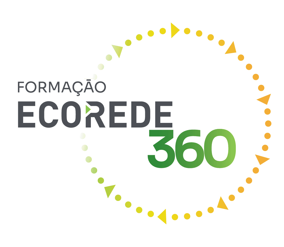
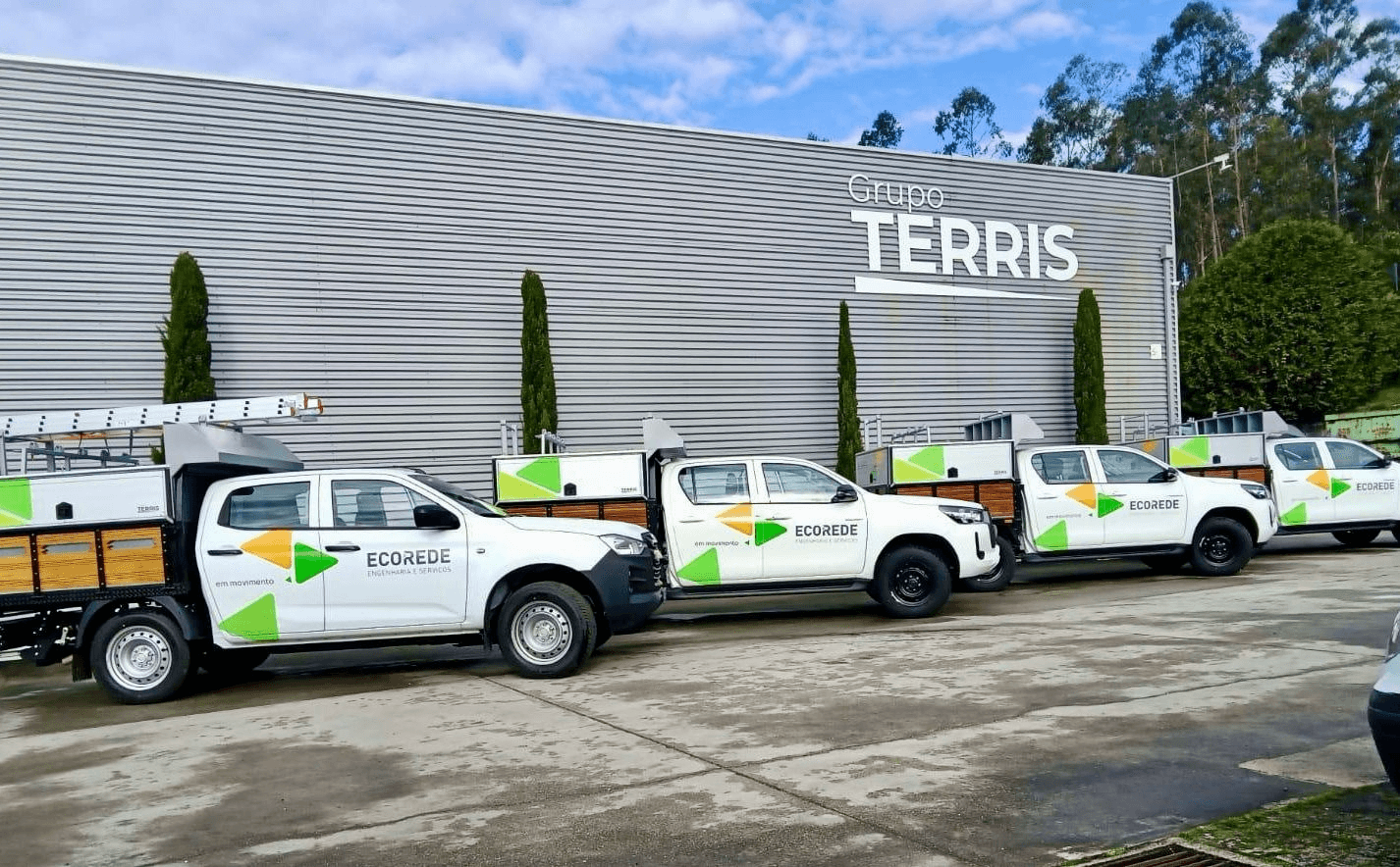
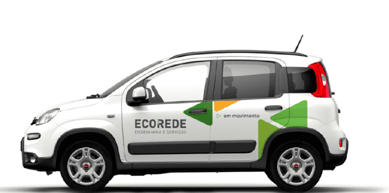
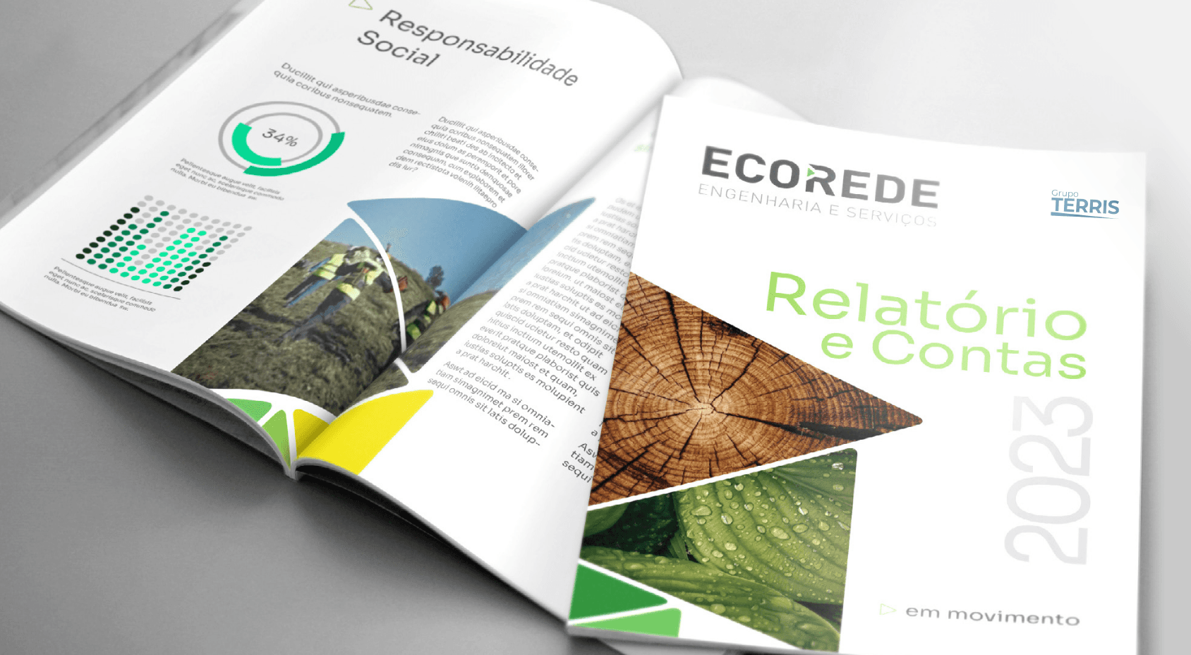
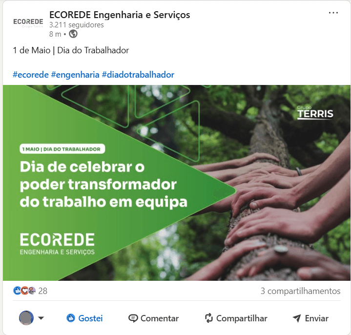
↓ Currently, the new brand is on display, and since 2023, I've been happily collaborating on its design and development, striving to boost Ecorede's brand uniformity and recognition even more. Below, you can explore additional application examples.
↓ Currently, the new brand is on display, and since 2023, I've been happily collaborating on its design and development, striving to boost Ecorede's brand uniformity and recognition even more. Below, you can explore additional application examples.
↓ Currently, the new brand is on display, and since 2023, I've been happily collaborating on its design and development, striving to boost Ecorede's brand uniformity and recognition even more. Below, you can explore additional application examples.

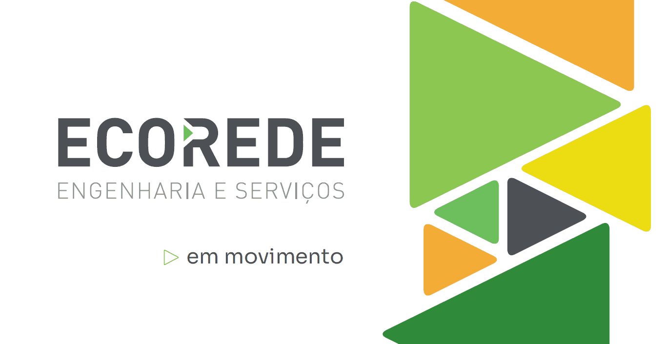

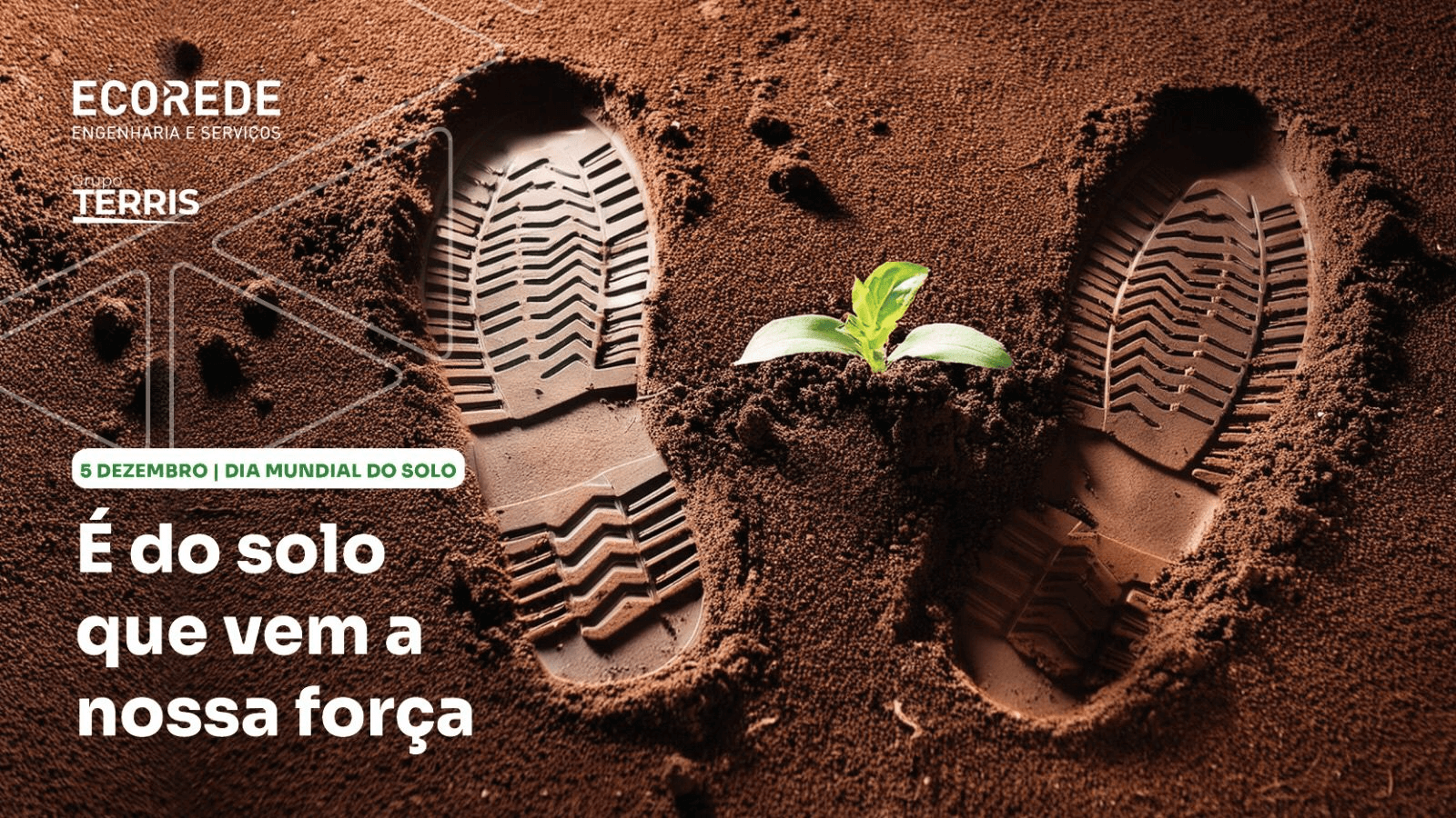


↓ To mirror this concepts, I expanded the original green and gray palette with vibrant tones of green, orange, and yellow, evoking freshness and modernity while preserving the brand´s essence. The result is a revitalized identity that celebrates Ecorede’s resilience, growth, and forward momentum.
↓ Currently, the new brand is on display, and since 2023, I've been happily collaborating on its design and development, striving to boost Ecorede's brand uniformity and recognition even more. Below, you can explore additional application examples.
↑ As the designer for Ecorede´s brand evolution, my challenge was to maintain its core identity while infusing vitality and movement. By collaborating closely with the team, we identified a brand persona that balances maturity with youthfulness, values unity and belonging, and embodies a dynamic, multifaceted spirit—leading to the new tagline: “em movimento” (in motion).
↓ The Ecorede logo’s triangular element, a key part of its identity, was retained for recognition but reimagined to reflect evolution. Rounded edges bring softness and approachability, aligning with the brand’s welcoming nature. The elongated, sharpened shape suggests forward motion and evokes a play symbol, embodying progress and new beginnings while balancing familiarity with innovation.