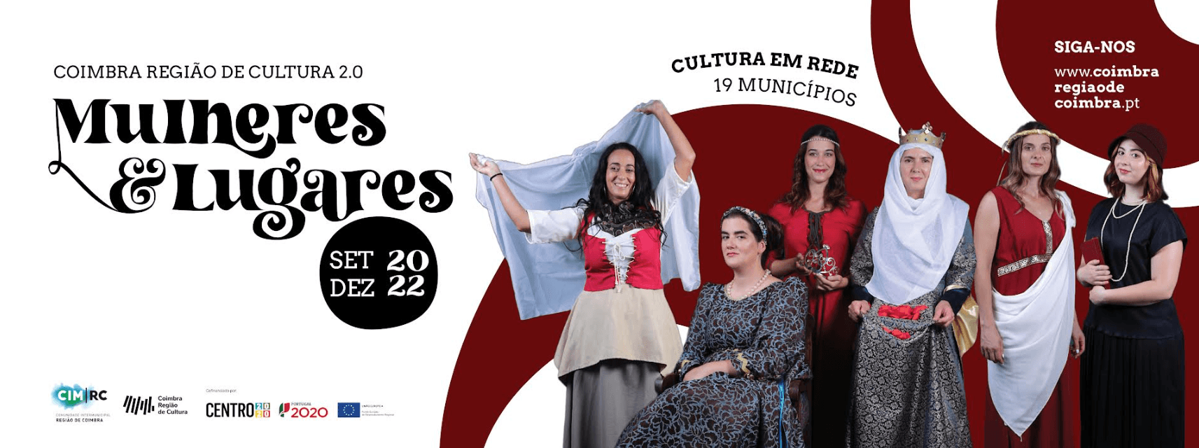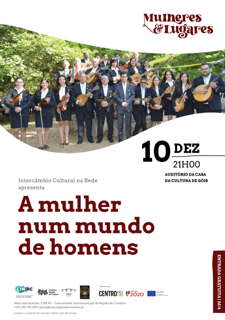
The project’s identity is defined by its logo, featuring a custom-designed typography created specifically for this initiative. The typeface conveys a sense of artistic freedom, characterized by pronounced curves and irregular serifs that evoke the medieval era while maintaining excellent readability.
Each individual poster within the project is distinct yet cohesive, adhering to the overall identity and ensuring recognition as part of the same initiative. The curved elements framing the photographs echo the flowing forms of the logo, offering a dynamic and organic aesthetic that makes each poster uniquely expressive.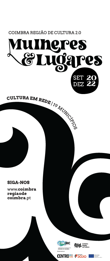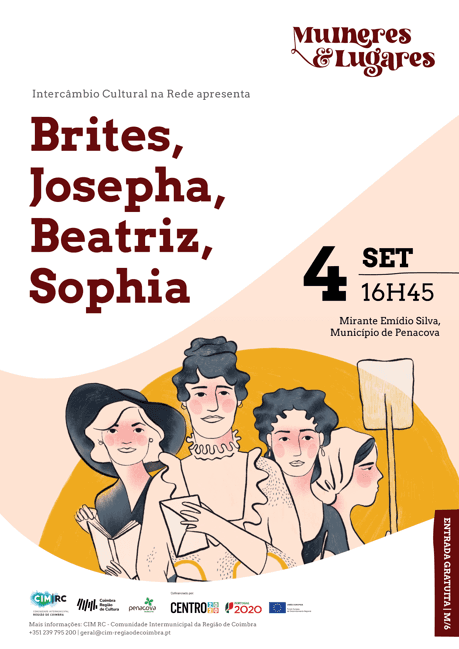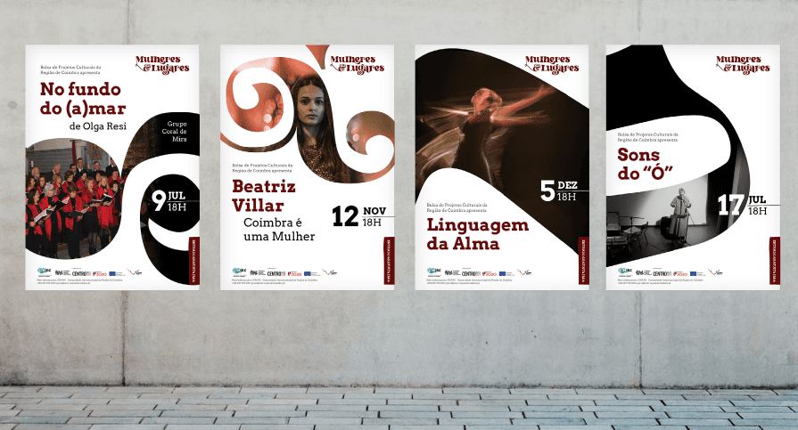