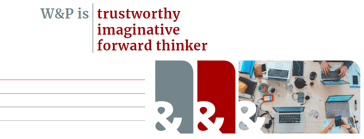
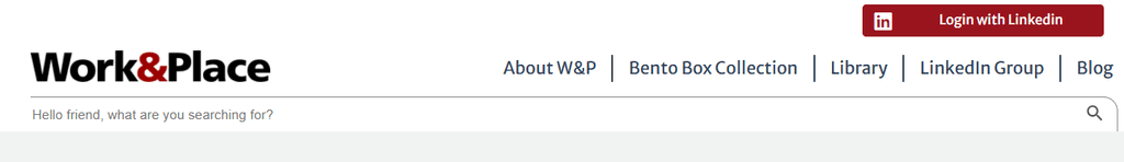
↑ The project began with the creation of a sleek style guide, evident in Work&Place’s refined graphics featuring clean lines and shapes with a distinctive curved edge. The “&” symbol, acting as a subtle cutout, harmonizes with the logo and unifies the brand’s visuals. A carefully chosen iconography set ensures meaningful communication aligned with the brand’s tone, while the versatile Merriweather font family enhances readability, modernity, and hierarchy. Complemented by a rich color palette that conveys solidity, trust, and professionalism, these elements come together to strengthen W&P’s cohesive and recognizable visual identity.
↓ The user experience on Work&Place was compromised due to inconsistent functionalities. The distinct 'Bento Box' feature of W&P, despite its noticeable presence on the homepage, did not receive the attention it should have.
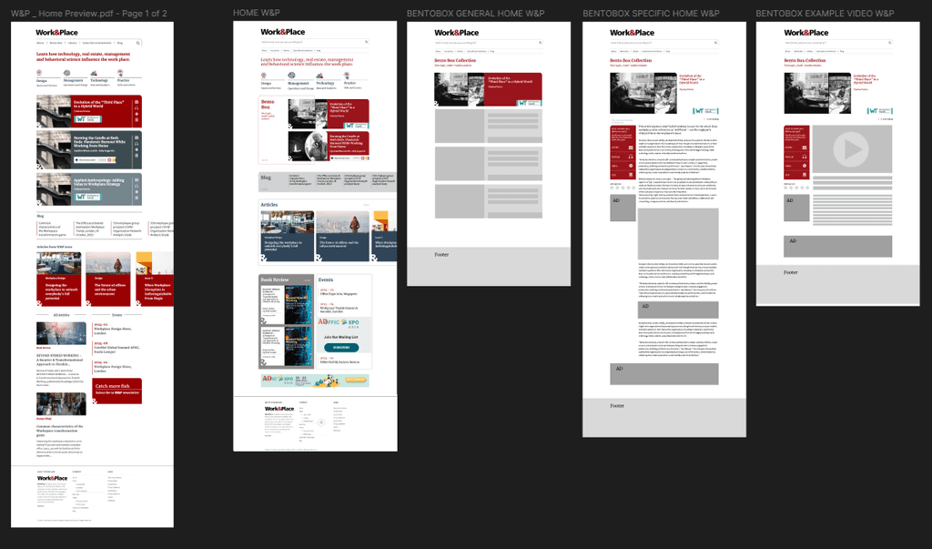
↓ After aligning the new style guide with the client, the next step was wireframing W&P’s website in Figma. The primary goal was to identify the key features to highlight while addressing the challenge of making the site more user-friendly and engaging.
↓ After aligning the new style guide with the client, the next step was wireframing W&P’s website in Figma. The primary goal was to identify the key features to highlight while addressing the challenge of making the site more user-friendly and engaging.
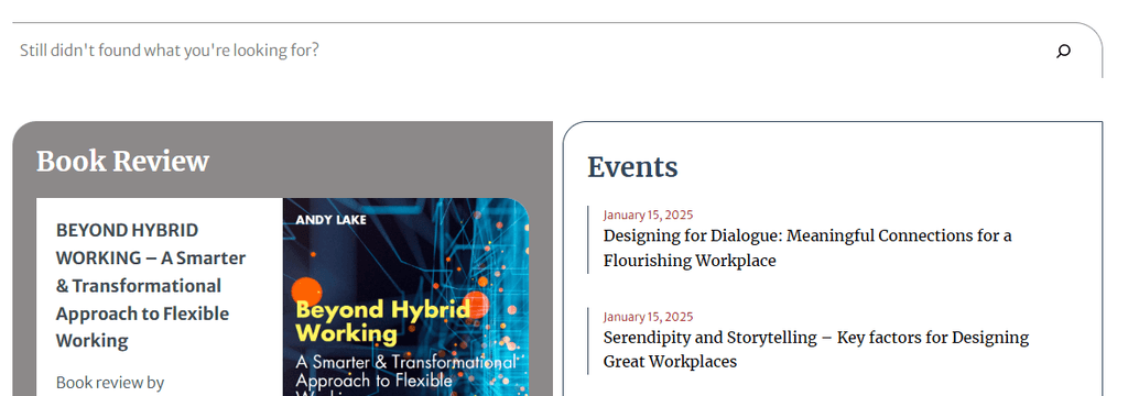
↓ One solution involved incorporating a responsive search bar throughout the navigation and refining the copy to create a closer connection with users.
↓ One solution involved incorporating a responsive search bar throughout the navigation and refining the copy to create a closer connection with users.
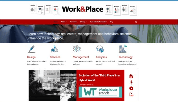
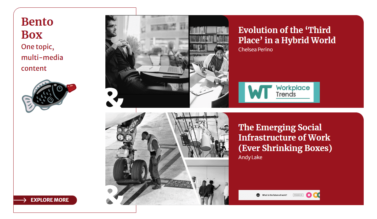
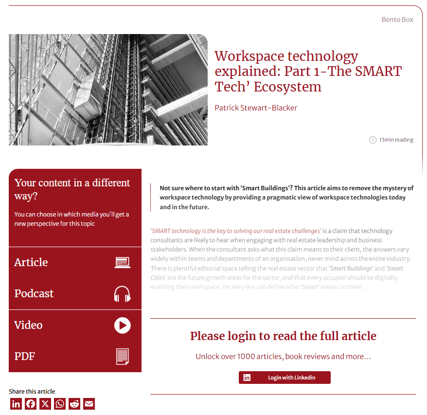
↓ The exclusive 'Bento Box' feature detailed above is a curated collection of multimedia around a singular theme. It was reimagined to facilitate seamless navigation between varying content. Its name borrows from the Japanese meal boxes, allowing diverse flavor combinations, and humorously, the soy sauce fish embodies the name. From the homepage, the user can view the latest duo of bento boxes while more can be discovered through the button. Upon selecting a content piece, a frictionless, user-friendly presentation of all the multimedia selections is displayed. Users only need to log in via LinkedIn to gain complete access.
→ The exclusive 'Bento Box' feature detailed above is a curated collection of multimedia around a singular theme. It was reimagined to facilitate seamless navigation between varying content. Its name borrows from the Japanese meal boxes, allowing diverse flavor combinations, and humorously, the soy sauce fish embodies the name. From the homepage, the user can view the latest duo of bento boxes while more can be discovered through the button. Upon selecting a content piece, a frictionless, user-friendly presentation of all the multimedia selections is displayed. Users only need to log in via LinkedIn to gain complete access.
↓ More details
↓ More details


Check Work&Place here.
Check Work&Place here.